TreeGrid documentation
| Author | Jos de Jong, Almende B.V. |
| Webpage | Chap Links Library |
| License | Apache License, Version 2.0 |
Contents
Related pages:
Overview
TreeGrid is a visualization which represents data in a hierarchical grid view. It is designed to handle large amouts of data. Items in the TreeGrid can contain custom HTML. Information in one item can be spread over multiple columns, and can have action buttons on the right.
Data for the TreeGrid can be a JSON array or a DataConnector. A DataConnector can be used to connect to a datasource on a server (for example a RESTful web service). Only data which is actually displayed in the TreeGrid will be requested via this DataConnector. TreeGrid offers built in functionality to sort, arrange, and filter items.
The TreeGrid is a stand alone library, and can be used as a Google Visualization Chart. It runs in every modern browser without additional requirements, and is tested on Firefox 3.6, Safari 5.0, Chrome 6.0, Opera 10.6, and Internet Explorer 8+. There is a GWT wrapper available to use the TreeGrid in GWT (Google Web Toolkit), you can find relevant documentation here.
DataConnector
A TreeGrid can be connected to a DataConnector, which is useful for data manipulation and lazy loading. When you are dealing with a small amount of readonly data, it is probably easiest to put the data in a simple JSON Array which is loaded from the server at once. But when dealing with large amounts of data, it will not be feasible to retrieve all data from the server, as it will take to much time and is very expensive for the server.
When dealing with large amounts of data, it is a good idea to use a DataConnector. When a TreeGrid is connected to a DataConnector, every time it redraws it will request the data that is currently displayed from the DataConnector. The DataConnector will check if it has the data in cache, and if it is up to date. If not, it will retrieve the missing data from the server.
Only retrieving the displayed items saves a lot of load on the server side, and keeps the client side fast and reactive. Retrieval of data is always done asynchronously. While retrieving data, the TreeGrid will display a "loading" status for the items being retrieved, to give the user feedback.
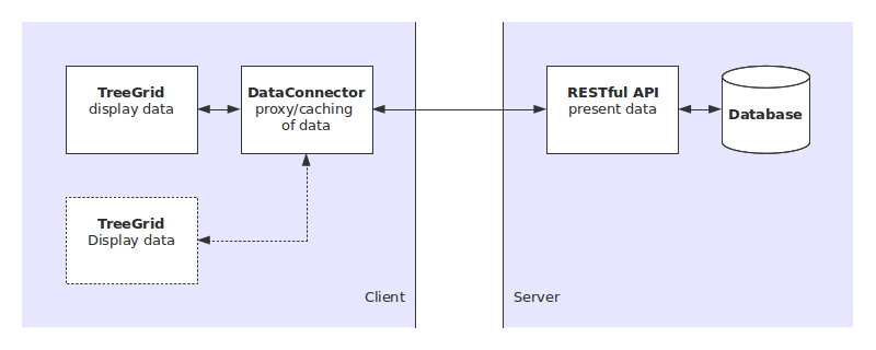
A DataConnector typically retrieves data from a RESTful web service. To connect a TreeGrid with your own RESTful web service, you will need to create your own DataConnector which connects to your RESTful web service.
How to create or use a DataConnector is described on the documentation page of the DataConnector at dataconnector.html.
Drag and Drop
The TreeGrid supports drag and drop operations inside one TreeGrid, and between different TreeGrids in one page.
Drag and drop is only supported when using a DataConnector. The dataconnector can be configured to allow or disallow various drag and drop actions. Drag and Drop must be supported by the server side of the DataConnector, A drag and drop action will remove items from one DataConnector, and append them to another DataConnector.
Subgrids
The Treegrid supports nesting of data (hence the name TreeGrid). Each item can have one or multiple fields containing a JSON Array or a DataConnector. In that case, the item becomes expandable. When expanded, the item displays the nested data as a subgrid right below itself.
Example
Below a treegrid example.
More examples can be found in the examples directory.
<!DOCTYPE HTML>
<html>
  <head>
    <title>TreeGrid demo</title>

    <style>
      body {
        font-family: arial;
        font-size: 10pt;
      }
    </style>

    <script type="text/javascript" src="../treegrid.js"></script>
    <link rel="stylesheet" type="text/css" href="../treegrid.css">

    <script type="text/javascript">
      // Called when the page is loaded
      function drawTreeGrid() {
        var data = [
          {
            "firstname": "John",
            "lastname": "Smith",
            "age": 15,
            "class": "B10",
            "courses": [
              {
                "course": "physics",
                "grade": "B",
                "courses": [
                  {"test": "test 1", "grade": "A"},
                  {"test": "test 2", "grade": "B"},
                  {"test": "final exam", "grade": "B"}
                ]
              },
              {"course": "maths", "grade": "C"},
              {"course": "economy", "grade": "B"}
            ]
          },
          {
            "firstname": "Susan",
            "lastname": "Brown",
            "age": 16,
            "class": "B10"
          },
          {
            "firstname": "David",
            "lastname": "Harris",
            "age": 14,
            "class": "B10",
            "courses": [
              {"course": "economy", "grade": "A"},
              {"course": "maths", "grade": "D"}
            ]
          }
        ];

        // specify options
        var options = {
          'width': '400px',
          'height': '200px'
        };

        // Instantiate our treegrid object.
        var container = document.getElementById('mytreegrid');
        var treegrid = new links.TreeGrid(container, options);

        // Draw our treegrid with the created data and options
        treegrid.draw(data);
      }
   </script>
  </head>

  <body onload="drawTreeGrid();">
    <div id="mytreegrid"></div>
  </body>
</html>
Loading
To load the TreeGrid, download the file treegrid.zip and unzip it in a sub directory timeline on your html page. Include the files treegrid.js and treegrid.css in the head of your html code.
<script type="text/javascript" src="treegrid/treegrid.js"></script>
<link rel="stylesheet" type="text/css" href="treegrid/treegrid.css">
The class name of the TreeGrid is
links.TreeGrid
var treegrid = new links.TreeGrid(container);After being loaded, the treegrid can be drawn via the method
draw,
provided with data and options.
treegrid.draw(data, options);
where data is a DataConnector or a JSON Array,
and options is a name-value map in the JSON format.
Data Format
The TreeGrid supports two data types: a JSON Array or a DataConnector. The items in an array or dataconnector can contain pointers to other arrays or dataconnectors, and the two data types can be mixed together.
Array
The TreeGrid supports a JSON Array as data format. The data from an array will be loaded once, and is usable for static data. The array must contain objects, with an arbitrary set of fields.
A table is constructed as:
var data = [
  {"firstname": "John", "lastname": "Smith", "age": 15, "class": "B10"},
  {"firstname": "Susan", "lastname": "Brown", "age": 16, "class": "B10"},
  {"firstname": "David", "lastname": "Harris", "age": 14, "class": "B10"}
];
DataConnector
In case of a DataConnector, data will be loaded and updated via
this data connector. There are a couple of DataConnectors provided by default,
such as the DataTable. New data connectors can be created for
other data sources, such as a RESTful web service or a database connection.
The DataConnector is documented on the page dataconnector.html.
Special fields
-
Subgrids
When an item has one or multiple fields containing a JSON Array or a DataConnector, the item becomes expandable. When expanded, the item displays this nested data as a subgrid right below itself.
Example:
var data = [ {"name": "John", "friends": [{"name": "Susan"},{"name": "Harry"}]}, {"name": "Susan"}, {"name": "David"} ]; -
Actions
Each item can contain a field
_actions, containing an array with one or multiple actions. Actions are displayed as a button or a link at the right side of an item. When clicked, an event will be fired.Name Type Required Description event String yes The name of the action. When the action is clicked, an event with this name is fired. Example events are 'delete', 'edit', 'open'. An eventlistener can be used to link an event to execution of a method. height String no The height of the action icon or text, for example '32px'. id * no An id for the action. image String no Url of an image to be displayed on the button. If no image is provided, the action will be displayed as a link. text String no The value of textwill be displayed as text for the link. If no text is provided, the name of the event will be displayed on the link. Only applicable when no image is provided.title String no When the mouse is hovered over an action, the title will be displayed. The title can contain an explanation of the action. width String no The width of the action icon or text, for example '32px'. Example:
var data = [ {"name": "John", "_actions": [{"event": "edit"}, {"event": "delete"}]}, {"name": "Susan", "_actions": [{"event": "edit"}, {"event": "delete"}]}, {"name": "David", "_actions": [{"event": "edit"}, {"event": "delete"}]} ]; -
Icons
Each item can contain a field
_icons, containing an array with one or multiple items. Items are displayed as an image at the left side of an item and can be used for visualizing a status or the type of an icon.Name Type Required Description height String no The height of the icon, for example '32px'. image String yes Url of an image to be displayed. title String no When the mouse is hovered over an icon, the title will be displayed. The title can contain an explanation of the icon. width String no The width of the icon, for example '32px'. Example:
var data = [ {"name": "John", "_icons": [{"image": "img/leader.png"}, {"image": "img/online.png"}]}, {"name": "Susan", "_icons": [{"image": "img/member.png"}]}, {"name": "David", "_icons": [{"image": "img/member.png"}, {"image": "img/online.png"}]} ]; -
Hidden fields
All fields starting with an underscore
_are hidden by default. For example to store a hidden field containing an id in the items, on can use a field named_id. The visibility and order of fields can be specified in more detail via a DataConnector (see dataconnector.html).Example:
var data = [
  {"name": "John",  "_id": "145912", "_rev": 6},
  {"name": "Susan", "_id": "142831", "_rev": 2},
  {"name": "David", "_id": "148692", "_rev": 14}
];
Configuration Options
Options can be used to customize the treegrid. Options are defined as a JSON object.
var options = {
  'width': '100%',
  'height': '600px',
  'items': {
    'defaultHeight' : 24,   // px
  }
};
The following options are available.
| Name | Type | Default | Description |
|---|---|---|---|
| width | String | '100%' | The width of the TreeGrid in pixels or as a percentage. |
| height | String | '100%' | The width of the TreeGrid in pixels or as a percentage. |
| indentationWidth | Number | 20 | The indentation with for nested grids, in pixels. |
| items.defaultHeight | Number | 24 | The default height of an item in pixels. This height is used to estimate the height of the TreeGrid contents for items which are not yet loaded. |
| items.minHeight | Number | 24 | The minimum height of an item in pixels. A minimum height of an item prevents the item from getting a height of zero in case of no data. |
Methods
The TreeGrid supports the following methods. Note that methods to manipulate the data are not available in the TreeGrid, but in the DataConnector of the data.
| Method | Return Type | Description |
|---|---|---|
| collapse(items) | none | Collapse one or multiple items. Items can be retrieved from a DataConnector using getItems().
|
| draw(data, options) | none | Loads data, sets options, and draws the TreeGrid.
data is a JSON Array or DataTable.
options is an (optional) JSON Object containing values for options.
|
| expand(items) | none | Expand one or multiple items. Items can be retrieved from a DataConnector using getItems().
|
| getSelection() | Array | Retrieve the selected items. |
| redraw() | none | Redraw the TreeGrid. When the height of the TreeGrid has been changed (for example when the height is 100% and the page is resized), this method can be used to force a redraw of the TreeGrid. |
| setSelection(items) | none | Replace the current selection. Parameter items can be a single item or an array with multiple items. Items can be retrieved from a DataConnector using getItems().
|
Events
The TreeGrid fires events after an item is selected, expanded, collaped, or when an action button is clicked. The events can be cached by creating a listener. Listeners can be registered using the event messages from the Google API or event messages from the CHAP Links library.
Here an example on how to catch a select event.
function onselect(properties) {
  alert('Selected items: ' + JSON.stringify(properties.items));
}

google.visualization.events.addListener(mytreegrid, 'select', onselect);
// Or, when using the event bus of the CHAP Links library:
//   links.events.addListener(mytreegrid, 'select', onselect);
The following events are available.
| name | Description | Properties |
|---|---|---|
| collapse | Collapse an item. |
|
| enter | Fired when the mouse hovers over an item. See also leave. |
|
| expand | Expand an item. This is only possible when the item contains nested data. This data will be displayed as a subgrid below the item. |
|
| leave | Fired when the mouse leaves an item. See also enter. |
|
| rangechange | Visible range is changing. Fired repeatedly while the user is modifying the visible window by moving (dragging) or by zooming (scrolling). | none |
| rangechanged | Visible range has been changed. Fired once after the user has modified the visible window by moving (dragging) or by zooming (scrolling) | none |
| ready | The chart is ready for external method calls. If you want to interact with the chart, and call methods after you draw it, you should set up a listener for this event before you call the draw method, and call them only after the event was fired. | none |
| select | When the user clicks on an item on the treegrid, it will be selected. The visualization then fires this event. The event is also fired when an item is deselected. This will return an empty array with items. |
|
User defined events
The TreeGrid can fire user defined events. This occurs when an item has action buttons defined (see Actions). The custom defined action event will be fired when the user clicks the action button.
Styles
All HTML elements of the TreeGrid have a class name and a default css style. The styles can be overwritten, which enables full customization of the layout of the TreeGrid.
For example, to change the background and the border of the header, include the following code inside the head of your html code or in a separate stylesheet.
<style>
.treegrid-header {
  color: white;
  background-color: #E157E9;
  border-color: #BF29C8;
}
</style>
| Class name | Description | Default style |
|---|---|---|
| .treegrid-frame | The frame surrounding the TreeGrid. |
border: 1px solid #BEBEBE; color: #1A1A1A; |
| .treegrid-header | The header, showing field names on top of a Grid. |
font-weight: bold; background-color: #D5DDF6; border-bottom: 1px solid #97B0F8; |
| .treegrid-header-field | An individual field containing one field name in the header. |
padding: 4px; |
| .treegrid-item | One item in a Grid, one row containing field values. |
border-width: 1px; border-style: solid; border-color: white; |
| .treegrid-item-selected | A selected item. |
background-color: #FFFF80; border-color: #FFD500; |
|
.treegrid-item-even .treegrid-item-odd |
All items have alternately a style treegrid-item-even or treegrid-item-odd, which can be used to create CSS zebra stripes. |
(none) |
|
.treegrid-level-0 .treegrid-level-1 .treegrid-level-2 ... |
All items have this style denoting how many levels deep they are nested. | (none) |
| .treegrid-item-dirty | An item which data is not up to date. |
color: gray; |
|
.treegrid-droparea, .treegrid-item-dragover |
A Drop area for dropping an item on another item. |
background-color: #F5F5F5; border: 1px dashed gray; |
| .treegrid-item-dragbefore | A Drop area for dropping an item in between two items. |
border-top-color: red; border-style: dashed; border-top-width: 1px; border-bottom-width: 1px; |
| .treegrid-item-dragbefore | A single field value in an item. |
padding: 4px; |
| .treegrid-drag-image | Layout for the drag image, shown when dragging one or multiple items around. |
padding: 5px; background-color: #FFFF80; border: 1px solid #FFD500; font-weight: bold; border-radius: 3px; z-index: 99999; position: relative; |
| .treegrid-fold | The fold/expand button in folded state. |
background: url('img/treeRightTriangleBlack.png') no-repeat center; cursor: pointer; |
| .treegrid-unfold | The fold/expand button in expanded state. |
background: url('img/treeDownTriangleBlack.png') no-repeat center; cursor: pointer; |
| .treegrid-loading-icon | Icon shown on the left side of an item when the item is being loaded. |
background: url('img/wait16trans.gif') no-repeat center; |
| .treegrid-error-icon | Icon shown on the left side of an item when there was an error retrieving this item. |
background: url('img/warning-icon-16.png') no-repeat center; |
|
.treegrid-fold, .treegrid-unfold, .treegrid-loading-icon, .treegrid-error-icon |
Layout equal for all buttons and icons. |
width: 20px; height: 24px; border: none; float: left; |
| .treegrid-verticalscroll-background | Background of the vertical scrollbar. |
background-color: gray; opacity: 0.1; filter: alpha(opacity=10);*/ /* For IE8 and earlier */ width: 100%; height: 100%; |
| .treegrid-verticalscroll-bar | The draggable bar of the vertical scrollbar. |
background-color: #BFBFBF; border: 2px solid white; |
| .treegrid-loading | Text displaying a loading message. | color: lightgray; |
| .treegrid-error | Text displaying an error message. | color: red; |
|
.treegrid-loading, .treegrid-error |
Style common for the loading and error messages | padding: 4px; |
| .treegrid-icons | Container for the icons, shown on the left of an item. | |
| .treegrid-icon | A single icon image, shown on the left of an item. |
padding-right: 4px; padding-bottom: 4px; |
|
.treegrid-actions |
Container for the action buttons, shown on the right of an item. | padding: 4px; |
|
.treegrid-action-image |
Style for an individual action, when an image is provided and the action is displayed as a button. |
margin-left: 5px; border: none; |
|
.treegrid-action-link |
Style for an individual action, when no image is provided and the action button is displayed as a link. |
margin-left: 5px; color: #97B0F8; |
|
.treegrid-action-link:hover |
Style for an individual action link when hovered. |
color: red; |
Data Policy
All code and data are processed and rendered in the browser. No data is sent to any server.