Timeline documentation
| Author | Jos de Jong, Almende B.V. |
| Webpage | Chap Links Library |
| License | Apache License, Version 2.0 |
Contents
- Overview
- Example
- Loading
- Data Format
- Configuration Options
- Methods
- Events
- Styles
- jQuery Themeroller integration
- Data Policy
Overview
The Timeline is an interactive visualization chart to visualize events in time. The events can take place on a single date, or have a start and end date (a range). You can freely move and zoom in the timeline by dragging and scrolling in the Timeline. Events can be created, edited, and deleted in the timeline. The time scale on the axis is adjusted automatically, and supports scales ranging from milliseconds to years.
When the timeline is defined as editable (and groupsChangeable and timeChangeable are set accordingly), events can be moved to another time by dragging them. By double clicking, the contents of an event can be changed. An event can be deleted by clicking the delete button on the upper right. A new event can be added in different ways: by double clicking in the timeline, or by keeping the Ctrl key down and clicking or dragging in the timeline, or by clicking the add button in the upper left of the timeline, and then clicking or dragging at the right location in the timeline.
The Timeline is developed as a Google Visualization Chart in javascript. It runs in every browser without additional requirements. There is a GWT wrapper available to use the Timeline in GWT (Google Web Toolkit), you can find relevant documentation here.
The Timeline is designed to display up to 1000 events smoothly on any modern browser.
Example
Here a timeline example. Click and drag to move the timeline, scroll to zoom the timeline.
More examples can be found in the examples directory.
<html>
  <head>
    <title>Timeline demo</title>

    <style>
      body {font: 10pt arial;}
    </style>

    <script type="text/javascript" src="http://www.google.com/jsapi"></script>
    <script type="text/javascript" src="../timeline.js"></script>
    <link rel="stylesheet" type="text/css" href="../timeline.css">

    <script type="text/javascript">
      google.load("visualization", "1");

      // Set callback to run when API is loaded
      google.setOnLoadCallback(drawVisualization);

      // Called when the Visualization API is loaded.
      function drawVisualization() {
        // Create and populate a data table.
        var data = new google.visualization.DataTable();
        data.addColumn('datetime', 'start');
        data.addColumn('datetime', 'end');
        data.addColumn('string', 'content');

        data.addRows([
          [new Date(2010,7,23), , 'Conversation<br>' +
            '<img src="img/comments-icon.png" style="width:32px; height:32px;">'],
          [new Date(2010,7,23,23,0,0), , 'Mail from boss<br>' +
            '<img src="img/mail-icon.png" style="width:32px; height:32px;">'],
          [new Date(2010,7,24,16,0,0), , 'Report'],
          [new Date(2010,7,26), new Date(2010,8,2), 'Traject A'],
          [new Date(2010,7,28), , 'Memo<br>' +
            '<img src="img/notes-edit-icon.png" style="width:48px; height:48px;">'],
          [new Date(2010,7,29), , 'Phone call<br>' +
            '<img src="img/Hardware-Mobile-Phone-icon.png" style="width:32px; height:32px;">'],
          [new Date(2010,7,31), new Date(2010,8,3), 'Traject B'],
          [new Date(2010,8,4,12,0,0), , 'Report<br>' +
            '<img src="img/attachment-icon.png" style="width:32px; height:32px;">']
        ]);

        // specify options
        var options = {
          "width":  "100%",
          "height": "99%",
          "style": "box" // optional
        };

        // Instantiate our timeline object.
        var timeline = new links.Timeline(document.getElementById('mytimeline'));

        // Draw our timeline with the created data and options
        timeline.draw(data, options);
      }
   </script>
  </head>

  <body>
    <div id="mytimeline"></div>
  </body>
</html>
Loading
To load the Timeline, download the file
timeline.zip
and unzip it in a sub directory timeline on your html page.
Include the two downloaded files (timeline.js and timeline.css) in the head of your html code.
When you use a Google DataTable for providing the data,
the Google API must be included too.
Note that the Google API is only available online, so it is not possible
to use it in an offline application.
<script type="text/javascript" src="http://www.google.com/jsapi"></script>
<script type="text/javascript" src="timeline/timeline.js"></script>
<link rel="stylesheet" type="text/css" href="timeline/timeline.css">
When the Google API is used, the google visualization tools needs to be loaded. This is not needed when using a JSON Array as data type.
google.load("visualization", "1");
google.setOnLoadCallback(drawTimeline);
function drawTimeline() {
  // load data and create the timeline here
}
The class name of the Timeline is links.Timeline
var timeline = new links.Timeline(container);After being loaded, the timeline can be drawn via the method
draw,
provided with data and options.
timeline.draw(data, options);
where data is a DataTable or a JSON Array,
and options is a name-value map in the JSON format.
The Timeline stores a link to the original data table, and applies changes
made from within the Timeline to this data table.
When the data table is changed externally, the Timeline can be updated by executing
redraw(). The Timeline can be linked to an other/new table
via draw(data) (without providing options).
When the website layout has been changed or resized, use checkResize()
to update the size of the timeline.
Data Format
The Timeline supports two data types: a JSON Array or a Google DataTable.
JSON
The Timeline supports a JSON Array as data format. The Array must contain
JSON Objects with fields start, end (optional),
content, group (optional), and
className (optional).
When JSON is used as data format (instead of Google DataTable), the
Timeline can be used offline.
A table is constructed as:
var data = [];

data.push({
  'start': new Date(2010, 7, 15),
  'end': new Date(2010, 8, 2),  // end is optional
  'content': 'Trajectory A'
  // Optional: a field 'group'
  // Optional: a field 'className'
  // Optional: a field 'editable'
});
Google DataTable
The Timeline requires a data table with two required and three optional columns. It is possible to use a Google DataTable or DataView, and the data can be queried from an external data source using Google Query. Note that the needed Google API is only available online and cannot be downloaded for offline usage.
A table is constructed as:
var data = new google.visualization.DataTable();
data.addColumn('datetime', 'start');
data.addColumn('datetime', 'end');
data.addColumn('string', 'content');
// Optional: a column 'group'
// Optional: a column 'className'
// Optional: a column 'editable'
// Optional: a column 'type'

data.addRow([new Date(2010,7,15), new Date(2010,8,2), "Trajectory A"]);
// ...
The Timeline checks the type of the columns by first reading the column id, and if not provided read the column label. If both the column id's and label's are undefined, the Timeline will use column 0 as start, column 1 as end, column 2 as content, column 3 as group, column 4 as className, and column 5 as editable.
Fields
The fields are defined as:
| Name | Type | Required | Description |
|---|---|---|---|
| start | Date | yes* |
The start date of the event, for example new Date(2010,2,23).
Remark: Months in the JavaScript Date object are zero-based,* If the type is set to floatingRange, the start is optional. |
| end | Date | no | The end date of the event. The end date is optional, and can be left null.
If end date is provided, the event is displayed as a range.
If not, the event is displayed as a box. |
| content | String | yes | The contents of the event. This can be plain text or html code. |
| group | any type | no | This field is optional. When the group column is provided,
all events with the same group are placed on one line.
A vertical axis is displayed showing the groups.
Grouping events can be useful for example when showing availability of multiple
people, rooms, or other resources next to each other. If none of the events has a group, the events will be drawn on top of the horizontal axis. When events overlap each other, the will be stacked automatically. |
| className | String | no | This field is optional. A className can be used to give events
and individual css style. For example, when an event has className
'red', one can define a css style
                .red {
                    background-color: red;
                    border-color: dark-red;
                }
.
Depending on how you apply your css styles, it may be needed to
(re)define the style for selected events
(class timeline-event-selected).
More details on how to style events can be found in the section
Styles.
|
| editable | Boolean | no | This field is optional. By providing the field editable, events can be made editable or read-only on an individual basis. If editable is true, the event can be edited and deleted. The editable setting of an individual event overwrites the global setting options.editable. So when the Timeline as a whole is read-only, individual events may be made editable, and vice versa. |
| type | String | no | Type of the event, optional. Available values: "box", "range", "dot", "floatingRange". By default, the type is "range" for events having a start and end date, and "box" for events with a start date. This default can be overwritten by the global option "style". |
Custom fields
It is possible to add custom fields to items. The Timeline will ignore them and leave them intact. When retrieving an item viagetItem, these custom fields
will be returned along with the known fields.
Configuration Options
Options can be used to customize the timeline. Options are defined as a JSON object. All options are optional.
var options = {
  "width":  "100%",
  "height": "auto",
  "style": "box",
  "editable": true
};
The following options are available.
| Name | Type | Default | Description |
|---|---|---|---|
| animate | boolean | true | When true, events are moved animated when resizing or moving them. This is very pleasing for the eye, but does require more computational power. |
| animateZoom | boolean | true | When true, events are moved animated when zooming the Timeline. This looks cool, but does require more computational power. |
| axisOnTop | boolean | false | If false (default), the horizontal axis is drawn at the bottom. If true, the axis is drawn on top. |
| cluster | boolean | false | If true, events will be clustered together when zooming out.
This keeps the Timeline clear and fast also with a larger amount of
events.
experimental |
| clusterMaxItems | Number | 5 | The maximum quantity of items that can be shown outside a cluster. Setting a low value is useful to limit the
height of the container element. This value must be at least one.
experimental |
| customStackOrder | function | none | Provide a custom sort function to order the items. The order of the items is determining the way they are stacked. The function customStackOrder is called with two parameters, both of type `timeline.Item`. |
| box.align | String | "center" | Alignment of items with style "box". Available values are "center" (default), "left", or "right"). |
| dragAreaWidth | Number | 10 | The width of the drag areas in pixels. When an event range is selected, it has a drag area on the left and right side, with which the start or end time of the even can be manipulated. |
| editable | boolean | false | If true, the events can be edited, created and deleted.
Events can only be editable when th option selectable is true
(default). When editable is true, the Timeline can fire events
change, changed, edit,
add, delete.
This global setting editable can be overwritten for individual events by providing the events with a field editable, as described in section Data Format. |
| end | Date | none | The initial end date for the axis of the timeline. If not provided, the latest date present in the events is taken as end date. |
| eventMargin | int | 10 | The minimal margin in pixels between events. |
| eventMarginAxis | int | 10 | The minimal margin in pixels between events and the horizontal axis. |
| groupsChangeable | boolean | false | If true, items can be moved from one group to another.
Only applicable when groups are used. See also option timeChangeable. |
| groupsOnRight | boolean | false | If false, the groups legend is drawn at the left side of the timeline. If true, the groups legend is drawn on the right side. |
| groupsOrder | boolean | function | true | Allows to customize the way groups are ordered. When true (default), groups will be ordered alphabetically. When false, groups will not be ordered at all. When a function, groups will be ordered using this sort function. While sorting, the sort function is called with two groups to compare as parameters, and the function must return 0 when a and b are equal, a value larger than 0 when a is larger than b, and a value smaller than 0 when a is smaller than b. |
| groupsWidth | string | none | By default, the width of the groups legend is adjusted to the group names. A fixed width can be set for the groups legend by specifying the groupsWidth as a string, for example "200px". |
| groupMinHeight | int | 0 | The minimum height of each individual group even if they have no items. The group height is set as the greatest value between items height and the groupMinHeight. |
| height | string | "auto" | The height of the timeline in pixels, as a percentage, or "auto".
When the height is set to "auto", the height of the timeline is automatically
adjusted to fit the contents. If not, it is possible that events get stacked
so high, that they are not visible in the timeline.
When height is set to "auto", a minimum height can be specified with the
option minHeight.
|
| locale | string | "en" | Choose locale for the Timeline.
The Built-in locale is english (en).
More locales are available in the file timeline-locales.js:
|
| max | Date | none | Set a maximum Date for the visible range. It will not be possible to move beyond this maximum. The maximum date itself is excluded. |
| min | Date | none | Set a minimum Date for the visible range. It will not be possible to move beyond this minimum. |
| minHeight | Number | 0 | Specifies a minimum height for the Timeline in pixels.
Useful when height is set to "auto".
|
| moveable | boolean | true | If true, the timeline is movable.
When the timeline moved, the rangechange events are fired.
|
| scale | links.Timeline.StepDate.SCALE | none | Set a custom scale. Automatic scaling will be disabled.
Both options scale and step must be set.
For example scale=SCALE.MINUTES and step=5 will result in minor steps of
5 minutes, and major steps of an hour.
Available scales: MILLISECOND, SECOND,
MINUTE, HOUR, WEEKDAY,
DAY, MONTH, YEAR.
As step size, choose for example 1, 2, 5, or 10.
|
| selectable | boolean | true | If true, the events on the timeline are selectable.
When an event is selected, the select event is fired.
|
| snapEvents | boolean | true | If true, the start and end of an event will be snapped nice integer values when moving or resizing the event. |
| stackEvents | boolean | true | If true, the events are stacked above each other to prevent overlapping events. This option cannot be used in combination with grouped events. |
| start | Date | none | The initial start date for the axis of the timeline. If not provided, the earliest date present in the events is taken as start date. |
| step | number | none | See option scale.
|
| style | string | "box" | Specifies the style for the timeline events.
Choose from "dot" or "box".
Note that the content of the events may contain additional html formatting.
It is possible to implement custom styles using the method addItemType.
|
| showCurrentTime | boolean | true | If true, the timeline shows a red, vertical line displaying the current
time. This time can be synchronized with a server via the method
setCurrentTime. |
| showCustomTime | boolean | false | If true, the timeline shows a blue vertical line displaying a custom time. This line can be dragged by the user. The custom time can be utilized to show a state in the past or in the future. When the custom time bar is dragged by the user, an event is triggered, on which the contents of the timeline can be changed in to the state at that moment in time. |
| showMajorLabels | boolean | true | By default, the timeline shows both minor and major date labels on the
horizontal axis.
For example the minor labels show minutes and the major labels show hours.
When showMajorLabels is false, no major labels
are shown. |
| showMinorLabels | boolean | true | By default, the timeline shows both minor and major date labels on the
horizontal axis.
For example the minor labels show minutes and the major labels show hours.
When showMinorLabels is false, no minor labels
are shown. When both showMajorLabels and
showMinorLabels are false, no horizontal axis will be
visible. |
| showButtonNew | boolean | false | Show the button "Create new event" in the a navigation menu. Only applicable when option `editable` is true. |
| showNavigation | boolean | false | Show a navigation menu with buttons to move and zoom the timeline. The zoom buttons are only visible when option `zoomable` is true, and and move buttons are only visible when option `moveable` is true. |
| timeChangeable | boolean | true | If false, items can not be moved or dragged horizontally (neither start time nor end time is changable).
This is useful when items should be editable but can only be changed regarding group or content (typical use case: scheduling events). See also the option groupsChangeable. |
| unselectable | boolean | true | If true, a selected event on the timeline can be un unselected.
If false, a selected event cannot be unselected unless when selecting
an other event. This means that as soon as the Timeline has a selected
event, it will remain in a state where there is always an event selected.
See also the option selectable.
|
| width | string | "100%" | The width of the timeline in pixels or as a percentage. |
| zoomable | boolean | true | If true, the timeline is zoomable.
When the timeline is zoomed, the rangechange event is fired.
|
| zoomMax | Number | 315360000000000 | Set a maximum zoom interval for the visible range in milliseconds. It will not be possible to zoom out further than this maximum. Default value equals about 10000 years. |
| zoomMin | Number | 10 | Set a minimum zoom interval for the visible range in milliseconds. It will not be possible to zoom in further than this minimum. |
Methods
The Timeline supports the following methods.
| Method | Return Type | Description |
|---|---|---|
| addItem(properties) | none | Add an item to the Timeline.
The provided parameter properties is an Object,
containing parameters start (Date), end (Date),
content (String), group (String),
className (String), and editable (Boolean).
Parameters start and content are required,
the others are optional.
|
| addItemType(typeName, typeFactory) | none | Add a custom item type to the Timeline, extending the built-in types
"box" and "dot".
Parameter typeName is a String,
and typeFactory is a constructor implementing the abstract
prototype links.Timeline.Item. To use a custom type,
specify the option style with the name of the custom type.
See example25_new_item_type.html for an example, or study the implementations of links.Timeline.ItemBox,
links.Timeline.ItemRange,
and links.Timeline.ItemDot in the sourcecode of the Timeline.
|
| cancelAdd() | none | An add event can be canceled by calling the method
cancelAdd from within an event listener that listens for
add events. This is useful when additions need to be approved.
|
| cancelChange() | none | A changed event can be canceled by calling the method
cancelChange from within an event listener that listens for
changed events. This is useful when changes need to be approved.
|
| cancelDelete() | none | A delete event can be canceled by calling the method
cancelDelete from within an event listener that listens for
delete events. This is useful when deletions need to be
approved.
|
| changeItem(index, properties) | none | Change properties of an existing item in the Timeline.
index (Number) is the index of the item.
The provided parameter properties is an Object,
and can contain parameters start (Date),
end (Date), content (String),
group (String), className (String),
and editable (Boolean).
|
| checkResize() | none | Check if the timeline container is resized, and if so, resize the timeline. Useful when the webpage is resized. |
| deleteAllItems() | none | Delete all items from the timeline. |
| deleteItem(index, preventRender) | none | Delete an existing item.
index (Number) is the index of the item.
preventRender (Boolean) is optional parameter to prevent re-render timeline immediately after delete (for multiple deletions). Default is false.
|
| draw(data, options) | none | Loads data, sets options, adjusts the visible range,
and lastly (re)draws the Timeline.
data is a Google DataTable or a JSON Array.
options is an (optional) JSON Object containing values for options.
|
| getCluster(index) | Object | Retrieve the properties of a single cluster. The returned object can
contain parameters start (Date), and items that has
each item contained in the cluster. Each item have the same properties as in a call to
getItem.
|
| getCustomTime() | Date | Retrieve the custom time.
Only applicable when the option showCustomTime is true.
time is a Date object.
|
| getData() | Google DataTable or JSON Array | Retrieve the current datatable from the Timeline. |
| getItem(index) | Object | Retrieve the properties of a single item. The returned object can
contain parameters start (Date), end (Date),
content (String), group (String). |
| getSelection() | Array of selection elements | Standard getSelection() implementation.
Returns an array with one or multiple selections. Each selection contains
the property row (if an item is selected) or cluster if
a cluster is selected.
|
| getVisibleChartRange() | An object with start and end properties |
Returns an object with start and end properties,
which each one of them is a Date object,
representing the currently visible time range. |
| getVisibleItems(start, end) | Array of row indices | Returns an array of item indices whose range or value falls within the
start and end properties, which each one of
them is a Date object.
|
| redraw() | none | Redraw the timeline. Reloads the (linked) data table and redraws the timeline when resized. See also the method checkResize. |
| setAutoScale(enable) | none | Enable or disable autoscaling.
If enable true or not defined, autoscaling is enabled.
If false, autoscaling is disabled.
|
| setCurrentTime(time) | none | Adjust the current time of the timeline. This can for example be
changed to match the time of a server or a time offset of another time zone.
time is a Date object.
|
| setCustomTime(time) | none | Adjust the custom time in the timeline.
Only applicable when the option showCustomTime is true.
time is a Date object.
|
| setData(data) | none | Set new data in the Timeline. All settings (such as visible range) stay
unchanged, and the timeline must be redrawn afterwards with the method
redraw.
data is a Google DataTable object or a JSON Array.
|
| setSelection(selection) | none | Standard setSelection(selection) implementation.
selection is an array with selection elements. The timeline
accepts only one selection element, which must have the property row.
The visible chart range will be moved such that the selected event is placed in the middle.
To unselect all items, use set selection with an empty array.
Example usage: timeline.setSelection([{row: 3}]);.
|
| setSize(width, height) | none | Parameters width and height are strings,
containing a new size for the timeline. Size can be provided in pixels
or in percentages. |
| setScale(scale, step) | none | Set a custom scale. Automatic scaling will be disabled.
For example setScale(SCALE.MINUTES, 5) will result in minor steps of
5 minutes, and major steps of an hour.
Available scales: MILLISECOND, SECOND,
MINUTE, HOUR, WEEKDAY,
DAY, MONTH, YEAR.
As step size, choose for example 1, 2, 5, or 10.
|
| setVisibleChartRange(start, end) | none | Sets the visible range (zoom) to the specified range. Accepts two parameters of type Date that represent the first and last times of the wanted selected visible range. Set start to null to include everything from the earliest date to end; set end to null to include everything from start to the last date. |
| setVisibleChartRangeNow() | none | Move the visible range such that the current time is located in the
center of the timeline. This method does not trigger a
rangechange event. |
| setVisibleChartRangeAuto() | none | Adjust the visible time range such that all events are visible. |
| move(moveFactor) | none | Move the timeline the given movefactor to the left or right.
Start and end date will be adjusted, and the timeline will be redrawn.
For example, try moveFactor = 0.1 or -0.1.
moveFactor is a Number that determines the moving amount.
A positive value will move right, a negative value will move left.
|
| zoom(zoomFactor, zoomAroundDate) | none | Zoom the timeline the given zoomfactor in or out. Start and end date
will be adjusted, and the timeline will be redrawn.
You can optionally give a date around which to zoom.
For example, try zoomfactor = 0.1 or -0.1.
zoomFactor is a Number that determines the zooming amount.
Positive value will zoom in, negative value will zoom out.
zoomAroundDate is a Date around which to zoom and it is optional.
|
Events
The Timeline fires events after an event is selected, the visible range changed, or when an event is changed. The events can be cached by creating a listener. Listeners can be registered using the event messages from the Google API or event messages from the CHAP Links library.
Here an example on how to catch a select event.
function onselect() {
  var sel = mytimeline.getSelection();
  if (sel.length) {
    if (sel[0].row != undefined) {
      var row = sel[0].row;
      document.title = "event " + row + " selected";
    }
  }
}

google.visualization.events.addListener(mytimeline, 'select', onselect);
// Or, when not using the Google API:
//   links.events.addListener(mytimeline, 'select', onselect);
The following events are available.
| name | Description | Properties |
|---|---|---|
| add | An event is about the be added.
Fired after the user has clicked the button "Add event" and created a new
event by clicking or moving an event into the Timeline.
The selected row can be retrieved via the method getSelection,
and new start and end data can be read in the according row in the data table.
The add event can be canceled by calling the method
cancelAdd from within the event listener. This is useful
when additions need to be approved.
|
none |
| change | The properties of an event are changing.
Fired repeatedly while the user is modifying the start date or end
date of an event by moving (dragging) the event in the Timeline.
The selected row can be retrieved via the method getSelection,
and new start and end data can be read in the according row in the data table.
|
none |
| changed | The properties of an event changed.
Fired after the user modified the start date or end date of an event
by moving (dragging) the event in the Timeline.
The selected row can be retrieved via the method getSelection,
and new start and end data can be read in the according row in the data table.
The changed event can be canceled by calling the method
cancelChange from within the event listener. This is useful
when changes need to be approved.
|
none |
| edit | An event is about to be edited.
This event is fired when the user double clicks on an event.
The selected row can be retrieved via the method getSelection.
|
none |
| delete | An event is about to be deleted.
Fired after the user clicked the "Delete Event" button on the right of
an event.
The selected row can be retrieved via the method getSelection,
and new start and end data can be read in the according row in the data table.
The delete event can be canceled by calling the method
cancelDelete from within the event listener. This is useful
when deletions need to be approved.
|
none |
| rangechange | Visible range is changing. Fired repeatedly while the user is modifying
the visible time by moving (dragging) the timeline, or by zooming (scrolling),
but not after a call to setVisibleChartRange or
setRangeToCurrentTime methods.
The new range can be retrieved by calling getVisibleChartRange
method. |
|
| rangechanged | Visible range has been changed. Fired once after the user has modified
the visible time by moving (dragging) the timeline, or by zooming (scrolling),
but not after a call to setVisibleChartRange or
setRangeToCurrentTime methods.
The new range can be retrieved by calling getVisibleChartRange
method. |
|
| ready | The chart is ready for external method calls. If you want to interact with the chart, and call methods after you draw it, you should set up a listener for this event before you call the draw method, and call them only after the event was fired. | none |
| select | When the user clicks on an event or a cluster on the timeline,
the corresponding row in the data table is selected.
The visualization then fires this event.
The selected row or cluster can be retrieved via the method getSelection.
|
none |
| timechange | The custom time bar is changing. Fired repeatedly when the user is
dragging the blue custom time bar, but not after a call to the
setCustomTime method.
The new custom time can be retrieved by calling getCustomTime
method. |
|
| timechanged | The custom time bar has been changed. Fired once after the user has
dragged the blue custom time bar, but not after a call to the
setCustomTime method. The new custom time can be retrieved by
calling getCustomTime method. |
|
Styles
All parts of the Timeline have a class name and a default css style. The styles can be overwritten, which enables full customization of the layout of the Timeline.
For example, to change the border and background color of all events, include the following code inside the head of your html code or in a separate stylesheet.
<style>
div.timeline-event {
  border-color: orange;
  background-color: yellow;
}
</style>
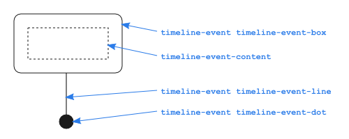
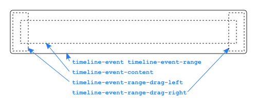
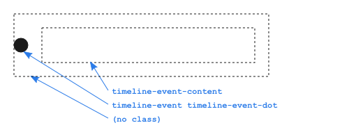
Structure
The events of type box, range, and dot
have the following structure.
Box
Range
Dot
Definitions
| Class name | Description | Default style |
|---|---|---|
| div.timeline-frame | The frame contains the canvas. It determines the size and the border of the Timeline. |
border: 1px solid #BEBEBE; overflow: hidden; |
| div.timeline-axis | A horizontal line forms the axis. |
border-color: #BEBEBE; border-width: 1px; border-top-style: solid; |
| div.timeline-axis-grid | The axis has a horizontal grid. |
border-left-style: solid; border-width: 1px; |
| div.timeline-axis-grid-minor | The axis has two grid lines: minor and major. When the scale is in days, each day gets a minor grid line, and each month a major grid line. |
border-color: #e5e5e5; |
| div.timeline-axis-grid-major | See div.timeline-axis-grid-major |
border-color: #bfbfbf; |
| div.timeline-axis-text | Both div.timeline-axis-text-minor and div.timeline-axis-text-major have
also the class div.timeline-axis-text. Use this class to set font styles
for both classes at once. |
color: #4D4D4D; padding: 3px; white-space: nowrap; |
| div.timeline-axis-text-minor | The axis has two grid types: minor and major. When the scale is in days, each day gets a minor text, and each month a major text. | |
| div.timeline-axis-text-major | See div.timeline-axis-text-minor |
|
| div.timeline-event | All different events (box, dot, range, line) have the class div.timeline-event. Use this class for example to set background and foreground colors. |
color: #1A1A1A; border-color: #97B0F8; background-color: #D5DDF6; |
| div.timeline-event-selected | All different events (box, dot, range, line) get the class div.timeline-event-selected when they are currently selected. Use this class to visually show the currently selected event. |
border-color: #FFC200; background-color: #FFF785; z-index: 999; |
| div.timeline-event-box | By default (option style="box"), events with only a start-date are drawn as a Box, having this class name. |
text-align: center; border-style: solid; border-width: 1px; border-radius: 5px; -moz-border-radius: 5px; |
| div.timeline-event-dot | Divs with the class div.timeline-event-dot are used
when the option style="dot" is used: a dot is drawn left from the event text.
Dots are also drawn with style="box", to draw the dot at the axis below each event. |
border-style: solid; border-width: 5px; border-radius: 5px; -moz-border-radius: 5px; |
| div.timeline-event-range | A range is drawn when an event has both start date and end date provided. |
border-width: 1px; border-style: solid; border-radius: 2px; -moz-border-radius: 2px; |
| div.timeline-event-range-drag-left | Drag area on the left side of the range |
cursor: w-resize; z-index: 1000; |
| div.timeline-event-range-drag-right | Drag area on the right side of the range |
cursor: e-resize; z-index: 1000; |
| div.timeline-event-line | When option style="box" is used (the default value), each event
is drawn as a box with a vertical line towards the axis. This line has the
class div.timeline-event-line. |
border-left-width: 1px; border-left-style: solid; |
| div.timeline-event-content | Each events from class box, dot, and range contain a div with class
div.timeline-event-content. This class contains the text of the event. |
margin: 5px; white-space: nowrap; overflow: hidden; |
| div.timeline-groups-axis | The right border of the vertical axis showing the different event groups. |
border-color: #BEBEBE; border-width: 1px; |
| div.timeline-groups-text | The text labels of the event groups on the vertical axis. |
color: #4D4D4D; padding-left: 10px; padding-right: 10px; |
| div.timeline-currenttime | The vertical line showing the current time. |
border-color: #FF7F6E; border-right-width: 2px; border-right-style: solid; |
| div.timeline-navigation | The navigation menu. Only visible when option showNavigation
is true. |
font-family: arial; font-size: 20px; font-weight: bold; color: gray; border: 1px solid #BEBEBE; background-color: #F5F5F5; border-radius: 5px; -moz-border-radius: 5px; |
| div.timeline-navigation-new, div.timeline-navigation-delete, div.timeline-navigation-zoom-in, div.timeline-navigation-zoom-out, div.timeline-navigation-move-left, div.timeline-navigation-move-right | The menu buttons in the navigation menu. You can change the images to your own icon set. |
cursor: pointer; margin: 2px 10px; float: left; text-decoration: none; border-color: #BEBEBE; |
| div.timeline-navigation-new | Menu button to create a new event. |
background: url('img/16/new.png') no-repeat center; |
| div.timeline-navigation-delete | Button to delete a selected event. The button is displayed at the top right of a selected event. |
padding: 0px; padding-left: 5px; background: url('img/16/delete.png') no-repeat center; |
| div.timeline-navigation-zoom-in | Button to zoom in on the timeline. |
background: url('img/16/zoomin.png') no-repeat center; |
| div.timeline-navigation-zoom-out | Button to zoom out on the timeline. |
background: url('img/16/zoomout.png') no-repeat center; |
| div.timeline-navigation-move-left | Button to move the timeline to the right, such that more of the left side of the timeline becomes visible. |
background: url('img/16/moveleft.png') no-repeat center; |
| div.timeline-navigation-move-right | Button to move the timeline to the left, such that more of the right side of the timeline becomes visible. |
background: url('img/16/moveright.png') no-repeat center; |
jQuery Themeroller integration
Most of jQuery widgets are theme aware in terms of jQuery Themeroller CSS framework. If you would like to make the Timeline aware of jQuery themes, please include in your page a Themeroller theme of your choice (ui.theme.css) and the CSS file timeline-theme.css. The file timeline.css should not be included. These two files are enough to style the Timeline according to the selected theme.
Data Policy
All code and data are processed and rendered in the browser. No data is sent to any server.